K2V Ltd. Standard Charts (explanation)
PERCEPTUAL RANGE Dashboard
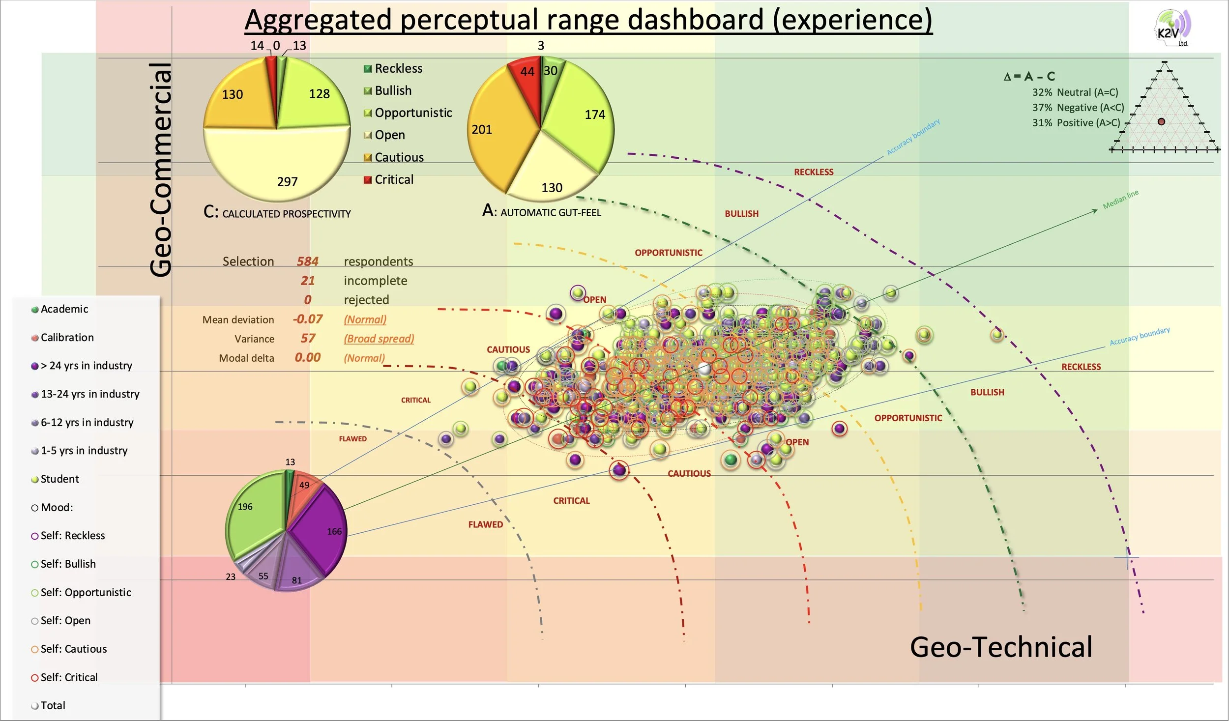
The “Perceptual Range” dashboard is a compilation of 5 charts on one display consisting of a main bubble chart, with 3 supporting pie-charts and a ternary chart, each visualising different elements of participant perceptions of value. All the charts accumulate live as participants submit their individual assessments of an opportunity.
Main bubble chart
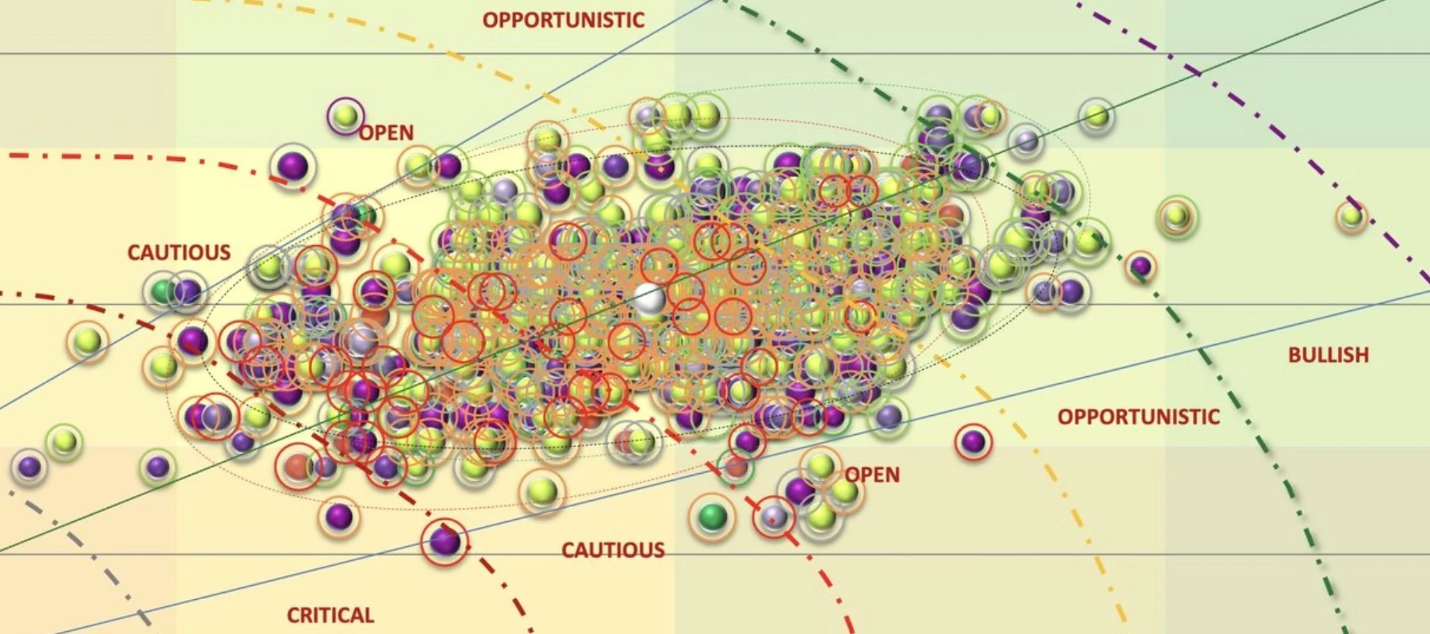
The main bubble chart aggregates individual submissions from a compilation of simulated data rooms, which appear as bubbles coloured by years of experience on Geo-commercial vs Geo-technical axes (calculated from 15 metrics) on a climbing scale (1-5) of relative attractiveness [1) critical, 2) cautious, 3) open, 4) opportunistic and 5) bullish]. The size of the bubble is determined by the total score, the colour by functional role (see legend) and the colour of the “halo” by the respondent’s automatic gut-feeling for the opportunity. The large white bubble in the centre is the aggregated average.

The two pie-charts at the top of the dashboard rollup calculated prospectivity (C - on the left) and automatic responses (A - on the right). C is calculated from the same 15 metrics in the main chart, whereas A represents a rollup of the self-reported Automatic, or intuitive opinion of respondents. Note that there is a slight skew towards the action in both plots but the real difference is in the yellow “open” wedge. C shows that over half of the participants’ evaluations classed as “open”, which is halved in A. In other words, A is much more polarised than C. A minus C (Delta) represents the perceptual gap identified by the simulation exercise. There are three categories represented by the delta:
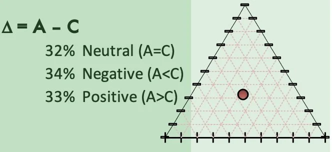
· When A = C, we call the category neutral
· When A < C, we call the category negative
· When A > C, we call the category positive
The small insert on the top right of the dashboard shows that roughly one third are neutral, negative and positive.
The expanded delta plot shows the three categories (neutral, negative and positive) plotted on each apex. The global population, where there is an equal mix of all three categories, plots in the centre of the bullseye (Null). Any heterogeneity in the population is represented by a deviation from the null (hypothesis: world is equally divided 3 ways), which is expressed as a vector (arrow), the visual expression of the identity of each cohort.